Justice Brothers Redesign

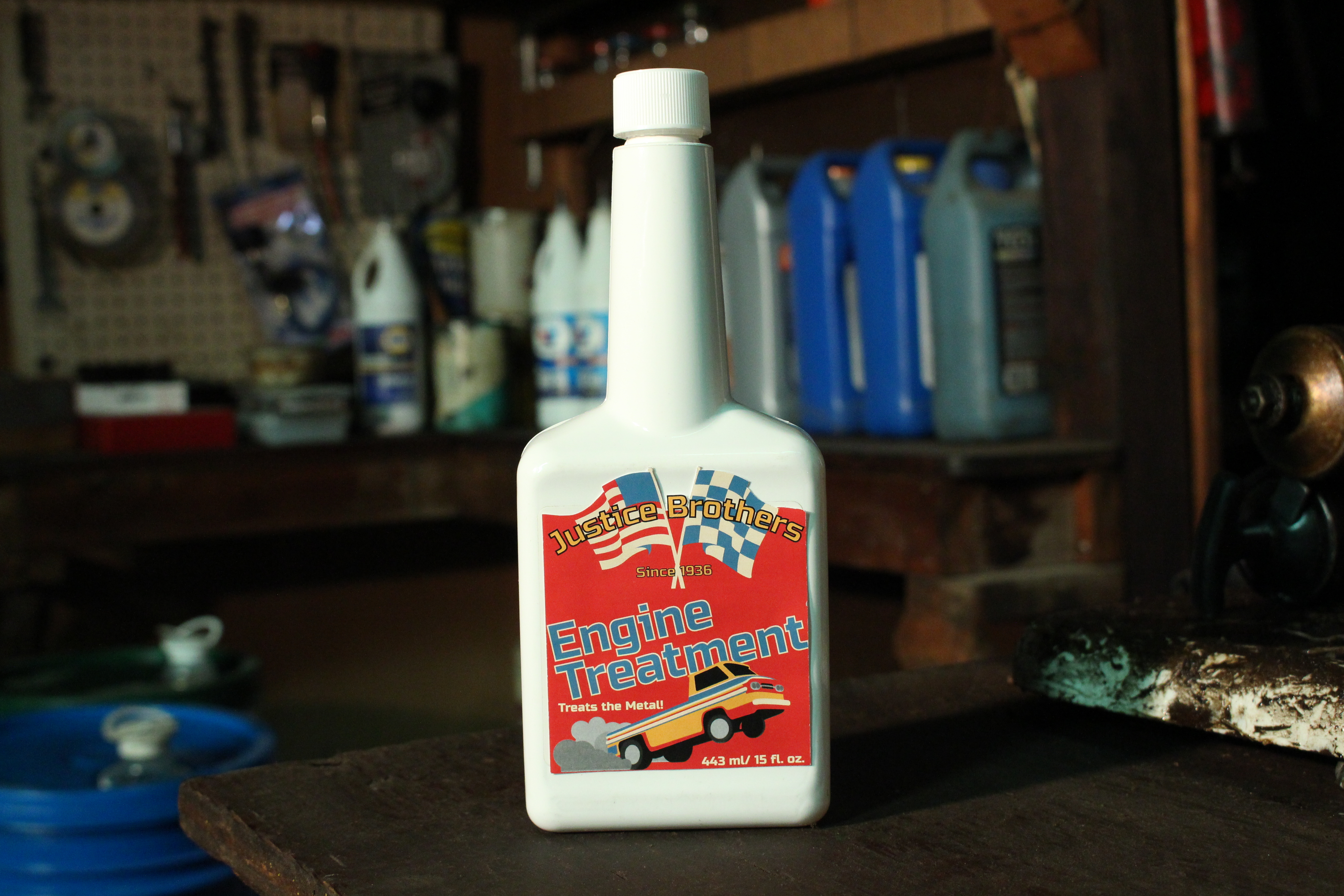
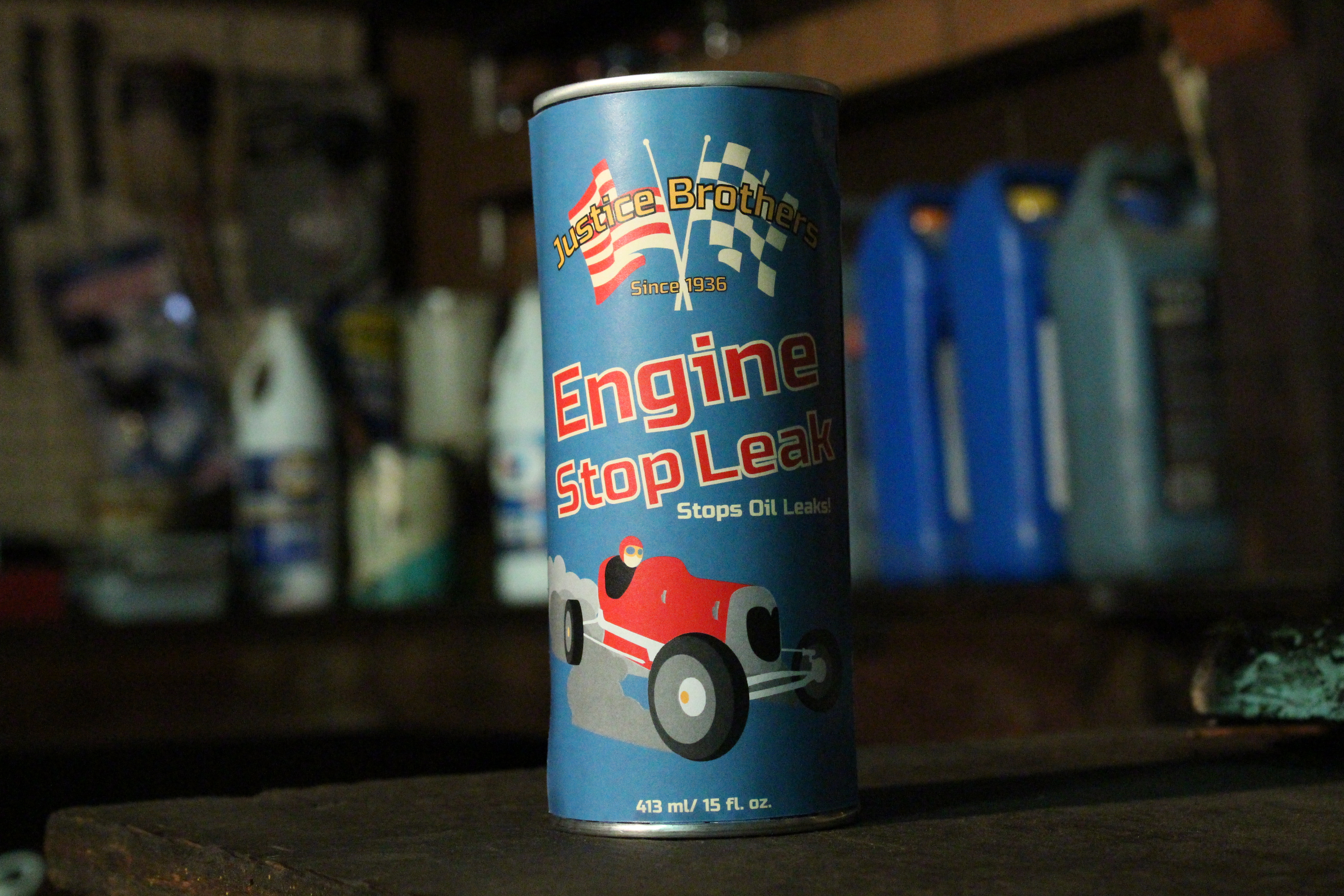
Justice Brothers is an oil additive company based out of California. While they have a long and storied past, their mark and packaging presents as dated. Thus, when given the chance to redesign the mark and packaging of my choice, I chosen them. The look of the mark was updated with a crossed flags logo and out lined text. The color pallet draws on the color scheme of old Justice Brothers logo. The packages where then created using coordinating colors with contrasting titles. Graphic recreation of racing cars from Justice Brothers’ past finish out the packaging.
Justice Brothers
No Comments